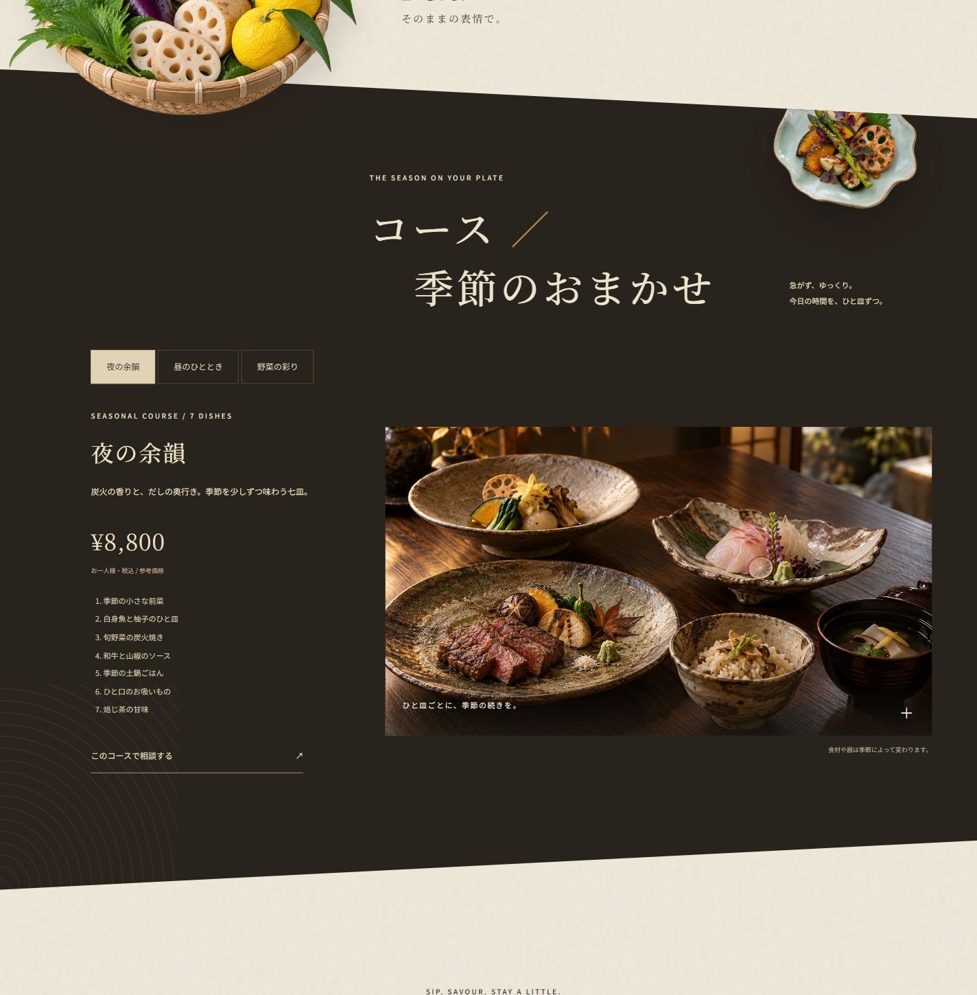
A diagonal dark seasonal-course theatre.
A tea-brown diagonal chapter meets floating vegetables. An unequal photo-and-menu composition supports three course choices, updating price, dishes and the visit-note link.
XN-080 / JAPANESE FUSION / OSAKA / DESIGN CONCEPT
A season on the plate. A moment to keep.
DESIGN WITH A POINT OF VIEW
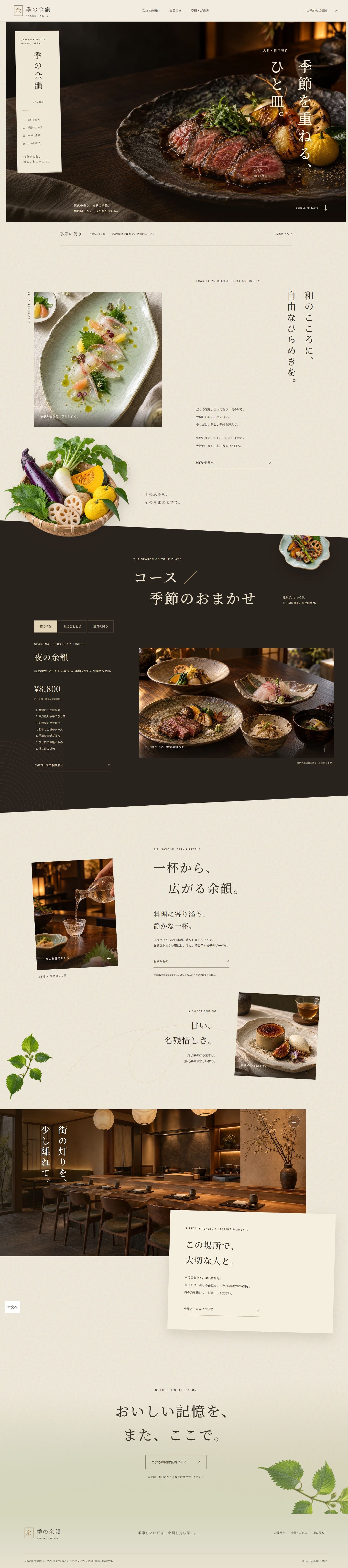
A three-page Japanese restaurant concept for Osaka. Floating paper navigation, vertical Japanese typography, charcoal-grilled dishes, a diagonal dark course chapter and floating ingredients form an editorial food story. Nine bespoke images support a dish album, photo reveals, drink filters and a locally saved visit-planning note.
Restaurants, seasonal dining and food brands. Extend with verified menus, reservation services and guest membership.
NAGORI is a fictional Osaka restaurant design concept, not an operating venue. Dishes, prices, interiors and hours are illustrative. Visit notes remain in the current browser; no reservation, payment or message is transmitted.
A tea-brown diagonal chapter meets floating vegetables. An unequal photo-and-menu composition supports three course choices, updating price, dishes and the visit-note link.
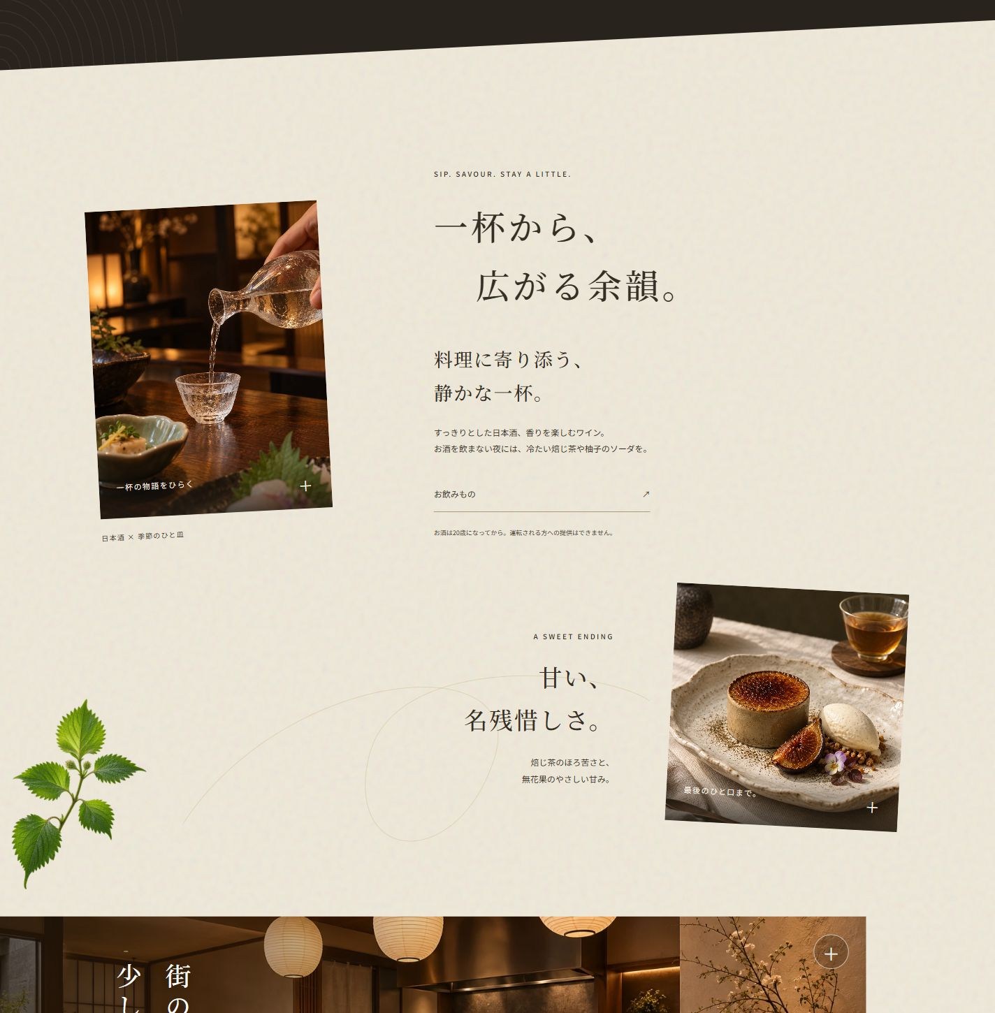
A tilted sake photograph and an opposite dessert image form a staggered composition. Shiso and a fine golden line cross the negative space; images enlarge by click or keyboard.
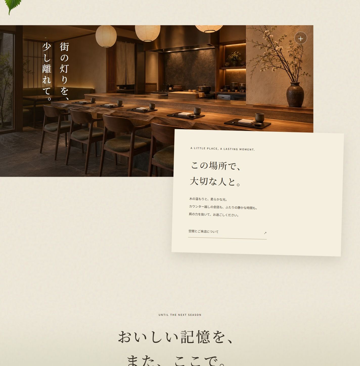
Interior photography and vertical copy lead into an overlapping paper panel. Olive and paper tones blend through the closing chapter into the footer.